Learn how to mix paints by creating a color wheel featuring primary, secondary, and tertiary colors.
When I first began painting and had little money to invest in paints I bought three primary colors, red, yellow, and blue, and I learned how to mix those three paint colors together to create any other color I needed for a painting.
When you take any of my online painting classes I provide you with a color swatch so you can see all of the paint colors I use to create each painting but you don't have to have all of the colors. You can easily create every color imaginable using just the three primary paint colors.
Learning how to mix colors is a great skill to have and a good way to practice the art of mixing colors is to create a color wheel. Once you create your color wheel you can use it as a guide while you are painting along with me during any of my video lessons.
Making your own color wheel.
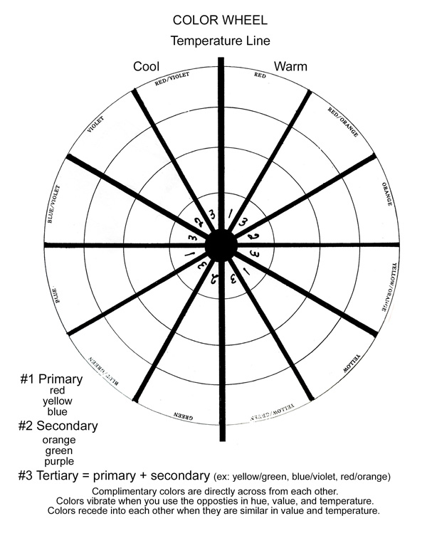
Print or trace the color wheel template (click here to open a printable PDF file) using wax-free graphite tracing paper onto a piece of watercolor paper. You can put sheets of lightweight (90-pound) watercolor paper through many home printers. You can even practice using heavy cardstock if you prefer to save a little money.
Just a note about the affiliate links to products in this post: I get a small commission for any sales created by you clicking on the links at no extra cost to you.
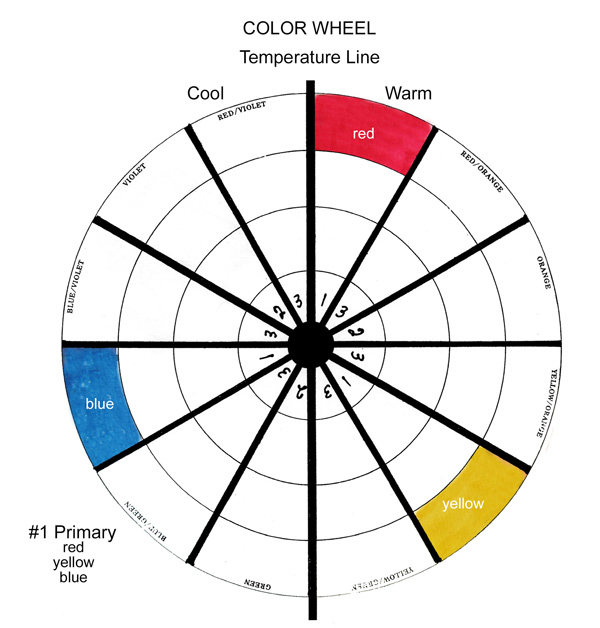
Let's start by painting your primary colors.
What are the primary colors?
- red
- yellow
- blue
Primary colors will come straight out of the tube. Every other color in the color wheel, including black, can be mixed using just these three colors.
You can use any brand of paint. I used Winsor & Newton Professional Water Colour paints to create my color wheel. I've listed the paint colors I used below.
- Permanent Rose (red)
- Antwerp Blue (blue)
- New Gamboge (yellow)
If you are a beginner painter, these are the first three tubes of paint I would recommend you purchase.
NOTE: There are many different primary paint colors available on the market and when you blend different reds, yellows, and blues together you will get slight variations in the color wheel. The colors you will see in my color wheel were created with the Winsor & Newton paint colors listed above.
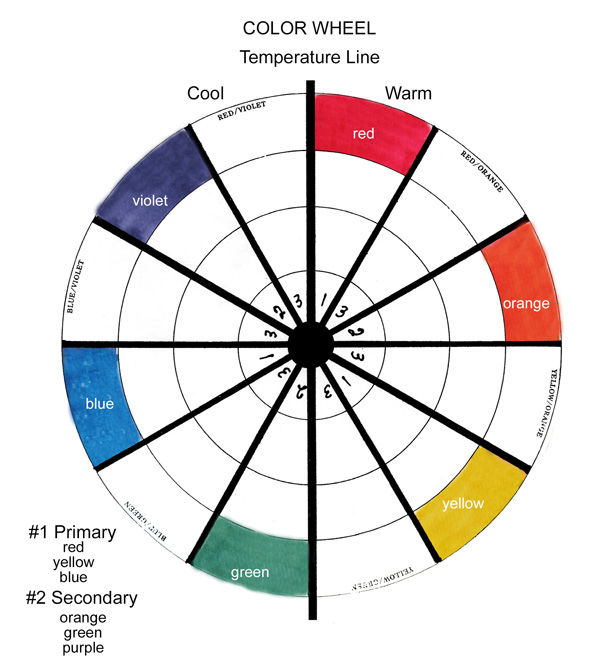
Secondary Colors
The secondary colors, orange, green, and purple (violet) are created by mixing equal parts of two primary colors together.
- orange = red + yellow
- green = yellow + blue
- purple (violet) = blue + red
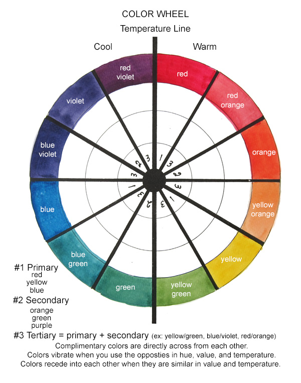
Tertiary Colors
You will create the six tertiary colors by blending a primary color with an adjacent secondary color. Tertiary colors are duller than the primary and secondary colors.
Typically the names of these tertiary colors begin with the primary color name plus the secondary color name as follows:
- yellow-orange
- red-orange
- red-violet
- blue-violet
- blue-green
- yellow-green
Complimentary Colors
Colors that are located directly opposite each other on the color wheel are known as complementary colors.
If you paint two complementary colors next to each other in a painting it will create a strong amount of contrast vibrancy, and excitement.
Analogous Colors
Colors that are next to each other on the color wheel create harmony and are very calming to the eye in any painting.
Triadic Colors
Colors that are equally spaced around the color wheel create vibrant color harmony and make a very dynamic effect in a painting.
To find Triadic colors you will look for any 3 colors that form a triangle in the color wheel.
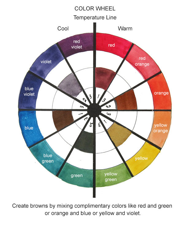
How to mix Browns
When you mix together two complementary colors (colors that are opposite each other on the color wheel like red and green or orange and blue) you will get different hues of browns.
Look at the variety of brown hues you get by mixing together the various colors. It's quite dramatic. You can use any complimentary colors to create brown.
How to mix black paint?
If you want a black, mix red, blue, and yellow. Use a palette knife to mix the paint colors. You do NOT want to add any water to the paint when trying to mix black.
How to achieve gray tones?
Simply mix varying amounts of water into your black paint in order to get a variety of grey colors. If you want a brownish-gray then mix water into a brown. You may need to add a little extra blue to get the color you want.
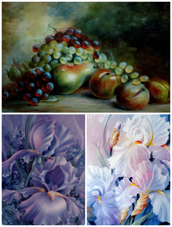
KEYS and TEMPERATURES
How to create a good overall effect
Step 1. Select a KEY.
There are 3 main Keys and variations on them.
HIGH KEY is a dominance of light with a little dark.
LOW KEY is a dominance of dark with a little light.
MIDDLE KEY is a dominance of middle values plus some dark and some light.
To plan a key to work in select your background value first. If it is light it will be High Key. If it is dark it will be Low Key. If it is a mid-value it will be Middle Key. These are the easiest to work with. Even though there are variations until you are an expert, it is my suggestion to stay with these three.
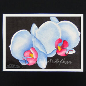
More advanced VARIATIONS are LOW CONTRAST and HIGH CONTRAST paintings. Consider a painting that you would describe as white on white. It may be low contrast. It still should have small darker values to direct the viewer. A very dark background with strong light values may be a High contrast painting. This is a favorite of mine because it is so dramatic. Your pics will stand out across a room.
Step 2. Select a TEMPERATURE.
Is it warm? Is it cool? It depends on what you are comparing it to.
For instance, if you have 3 shades of blue, how do you compare them. Ask yourself if one leans to the green side. That means it has a little yellow in it making it warmer than a true blue. This is basically how you determine the temperature of all colors. If the color leans to a color on the warm side of the color wheel it is warmer than the color that leans to blue. Pick up some beige color charts from a paint store. See if you can see the variations in Temperature.
How to determine the Temperature that will be a good dominant one in your painting is the next question. Look at the selection you made for your Key. Is it warm or cool? If it is warm your painting should have a dominance of warm colors. If it is cool, have a dominance of Cool colors. You still need a small amount of the opposite for interest.
To make something recede, paint it SIMILAR in value and temperature to what surrounds it. Cool will recede into cool and warm will recede into warm. Opposites next to each other create vibration and draw attention like Warm next to cool, dark next to light, rough next to smooth, complementary colors next to each other all do this.
Understanding Keys and temperature will help you determine the colors to choose to create a good overall effect. One more tip. If you were viewing and an art piece that you wanted to buy for your home, think about how you would describe it to a friend. You might say it had glorious Sunflowers {Yellows & gold & orange and brown} with a little touch of blue-green for the leaves or background. That would be a warm painting. How about an ocean painting? It might be full of blues and violets and some green. Maybe it has a small amount of grey-brown in the rocks. It would be an overall cool painting. I hope this helps in the process and gives you a starting point.

